Using Arc Theme to Style a Website
Arc is the first browser that truly excites me. Up until then, the browsers I’ve used (basically all of them) felt uninspiring and struggled to engage users. The websites shown were in contrast vibrant and engaging. Arc complements websites and enhances the whole browsing experience. Apart from its captivating looks, it’s easy to use, has great performance, and I can customize it in various ways.
One of the customization options that Arc provides is changing the theme, which as I recently discovered, does not only change the colors of the browser itself, but also inserts the color configuration as css variables to the root of any page you are browsing. The inserted variables for a specific theme look like this:
:root {
    --arc-palette-subtitle: #D4AD97FF;
    --arc-palette-foregroundSecondary: #EF8C62FF;
    --arc-palette-foregroundPrimary: #EF8C62FF;
    --arc-palette-hover: #E9D6CBFF;
    --arc-palette-background: #F4EBE5FF;
    --arc-palette-maxContrastColor: #993810FF;
    --arc-palette-title: #2E1000FF;
    --arc-palette-minContrastColor: #FCEBE4FF;
    --arc-palette-backgroundExtra: #FEFDFCFF;
    --arc-palette-foregroundTertiary: #FCEBE4FF;
    --arc-palette-focus: #CA997EFF;
    --arc-background-simple-color: #EF8C62FF;
    --arc-palette-cutoutColor: #FCEBE4FF;
}
I have noticed this just as I was adding themes to my blog so, naturally, I wanted to see whether I could use them as a separate theme option for my readers that use Arc. Not only I could, but turns out it’s also remarkably simple.
Themes In Css
To implement different themes in css, all you have to do is decide on some colors you want to use for your elements, define the colors as variables, and then plug in the desired values to the relevant places. The simplest use case for themes includes light and dark modes.
Here is my base, light theme configuration:
html[data-theme='light'] {
   --color-background: #F8F7F4;
   --color-primary: #092230;
   --color-secondary: #54524F;
   --color-secondary-80: rgba(84, 82, 79, 0.8);
   --color-code: #3C3B39;
   --background-code-color: rgba(119, 117, 112, 0.1);
   --color-highlight: #FF6E50;
   --color-highlight-24: rgba(255, 110, 80, 0.24);
}
The variables are then used throughout the website. Here is an example of how I use the variables on the body of the website (the whole global.css can be seen in the repo):
body {
	background: var(--color-background);
	color: var(--color-primary);
}
This is fundamental CSS theming. To use the Arc-provided variables, I identified which colors suited my components, and swap the hex color codes for the variables inside css. Here is the arc config I use:
html[data-theme='arc'] {
--color-background: var(--arc-palette-background);
--color-primary: var(--arc-palette-maxContrastColor);
--color-secondary: var(--arc-palette-foregroundPrimary);
--color-secondary-80: var(--arc-palette-foregroundSecondary);
--color-code: var(--arc-palette-foregroundSecondary);
--background-code-color: var(--arc-palette-backgroundExtra);
--color-highlight: var(--arc-palette-title);
--color-highlight-24: var(--arc-palette-hover);
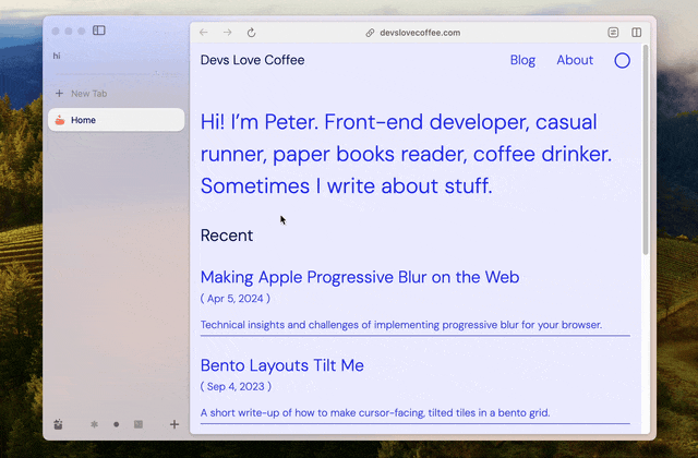
}Arc updates the variables instantly when the theme changes, recalculating CSS in real-time, as shown in the following gif:
Getting Arc Info
To determine whether someone is using Arc and provide the option to switch on the Arc option, I use this piece of code:
const usingArc = getComputedStyle(document.documentElement).getPropertyValue('--arc-palette-background') !== '';Then I just check whether usingArc is true, and if so, the arc theme is applied. The whole logic can be seen in my ThemeToggle component here.