Making Apple Progressive Blur on the Web
Apple consistently sets the benchmark for great design, defining or popularizing trends that quickly spread worldwide and get widely adopted. Recently, they have emphasized progressive blur, visible in the App Store, Apple Maps, and the new Apple visionOS. This inspired me to explore whether I could recreate this effect for the web (for users outside the Apple ecosystem).
While redesigning this blog, I wanted a blurred header. The common approach—applying a single blur with a semi-transparent solid color—felt too plain and uninspired. I wanted a progressive blur effect similar to Apple’s signature style.
Gradient Blur Since 2009
Progressive blur, also known as ‘gradient blur,’ is not new. It appears in Photoshop forums from 2009, a Stack Overflow question from 2017, and a Motion guide from 2019. However, I found no practical examples or easy HTML and CSS generators for progressive blur on the web.
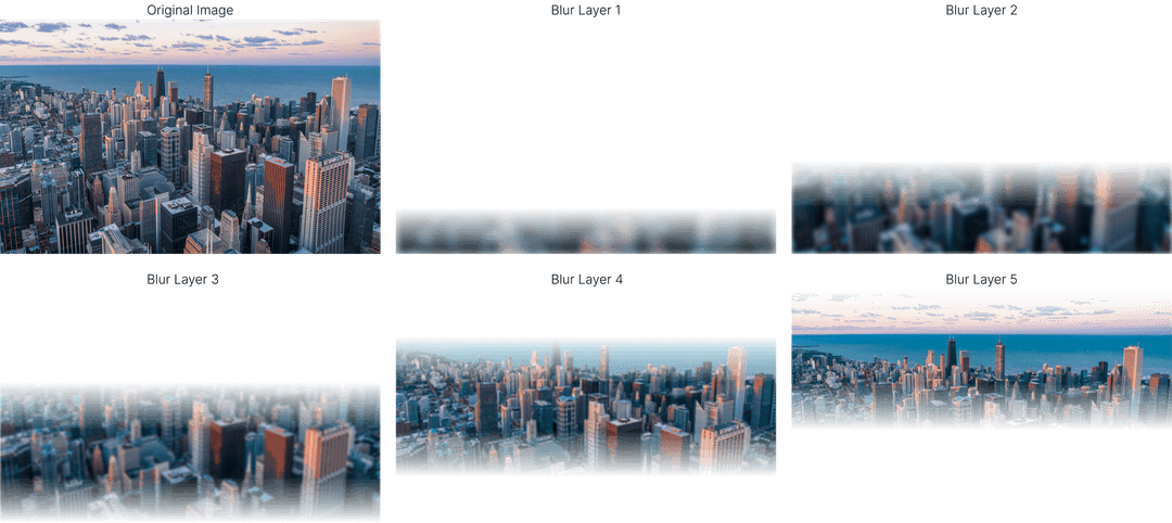
My initial solution for this blog used this CodePen. It stacks multiple divs, each with increasing backdrop blur and gradient masks, progressively blurring the background. While effective for a single use, I wanted a flexible method that works on any element without extensive CSS tuning.
The Blur Is Not Enough
You might wonder: why stack blurs instead of using a single blur with a mask? Here is an example of a single-blur effect. The blurred area looks like a bloom, and the transition between blurred and sharp is nearly invisible. Using white text, as Apple does, causes poor readability because the background retains high-frequency color changes.
Progressive blur addresses this by increasing blur progressively to lower background frequency and improve text readability. Simply increasing blur radius doesn’t work; at 32px blur (instead of 10px), the image becomes hazy and loses the intended effect due to over-blurring.
Stacking Blurs
My takeaways so far are:
- the stacking is definitely needed
- doing it manually every time is not viable
Only one possible conclusion could have come out of this: I need to make a progressive blur editor with a HTML + css generator.
Using Backdrop Filter
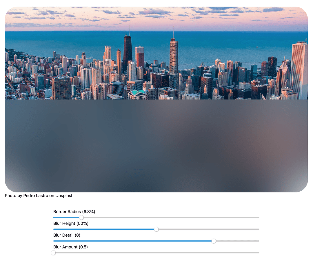
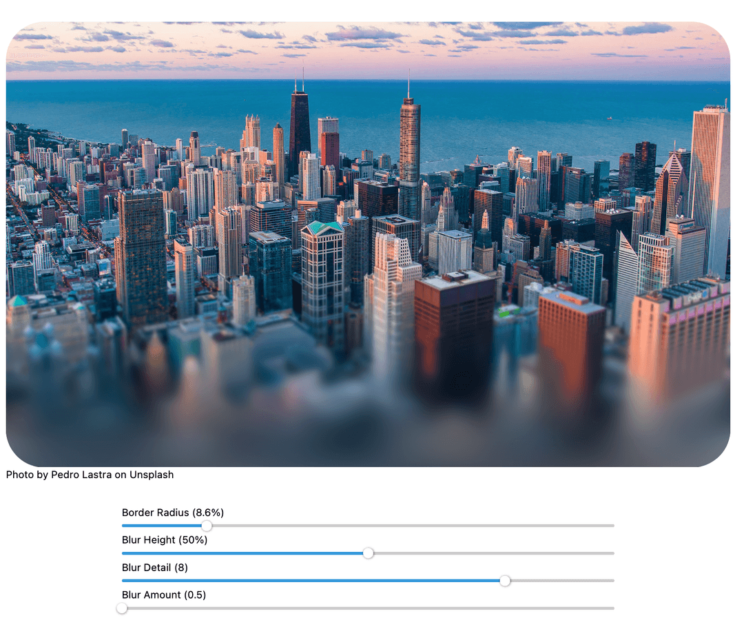
My first step was to transform the static blur into an interactive tool with editable parameters. I created a simple website featuring images and sliders to adjust blur settings visually. Multiple div elements layered over the image applied incremental backdrop blur filters with linear gradient masks.
This approach delivered the desired effect and performed efficiently, although I have not benchmarked it formally. However, it revealed a flaw: increasing the wrapping element’s border-radius caused issues in Chrome, the leading browser by Google:
Chromium struggles with multiple stacked backdrop filters combined with masks and overflow: hidden on the wrapper. The cause remains unclear, but this Stack Overflow answer offers insights. Surprisingly, Safari and Firefox handle border-radius and progressive blur simultaneously without issue. Since Chrome dominates browser usage, we needed a compatible solution for it.
Blurring Multiple Images On Top Of Each Other
The alternative solution supports border radius in Chrome but is resource-intensive—it sometimes causes lag, indicating performance issues—and is not recommended for production use on websites. Proceed with caution.
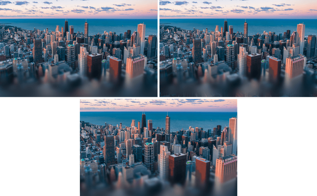
This method builds progressive blur by stacking multiple divs, each showing the original image as a background with blur and mask applied. Without using backdrop filters, it handles border-radius correctly. The drawback is duplicating large images with substantial blur radii (up to 512px), which consumes significant resources. Below is a comparison between the two approaches: backdrop-filter on the left and stacked blur layers on the right.
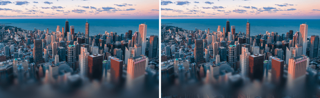
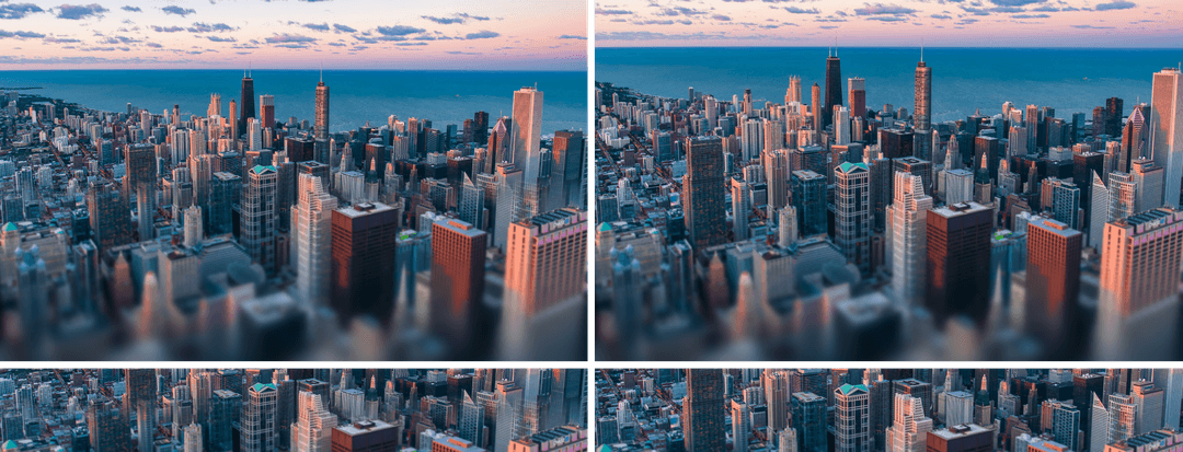
They look pretty much the same, except for this part:

The artifact occurs because the blur filter does not extend beyond the image edges (due to zero padding), resulting in incomplete blur even at 512px radius. To fix this, I scaled the image up by 1.2 times. This value worked well in most cases without cropping too much of the image. It is still a tradeoff, but if we are using the progressively blurred image as a card, we can afford our image to be cut off. Below is the comparison with the scaled image using blurs:
An alternative approach is to scale only the blur, allowing the effect to reach edges while keeping the original image unchanged. However, this fails here because the blurred layer must align perfectly with the background image. Any scaling or offset difference causes visible mismatch, as shown below: left image scales only blur; right image scales both blur and image.
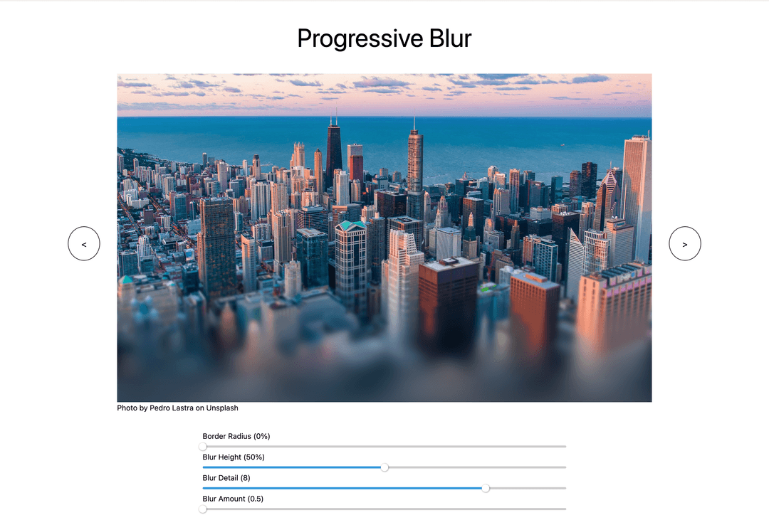
The Generator
The generator is simple: it accepts parameter inputs via sliders, calculates mask alpha gradients, blur intensities, and creates the corresponding div elements with blur effects. It displays the progressively blurred image and generates copy-paste-ready HTML and CSS code for your website.
Try the interactive progressive blur generator here: posterramen.devslovecoffee.com/progressive-blur
View the project source code here: GitHub repository.